
Graphing Netflix Social Networks in Python
Published:
In this post, we use a dataset posted on Kaggle as fodder for creating a vast network of communities of actors and directors spread around the world!
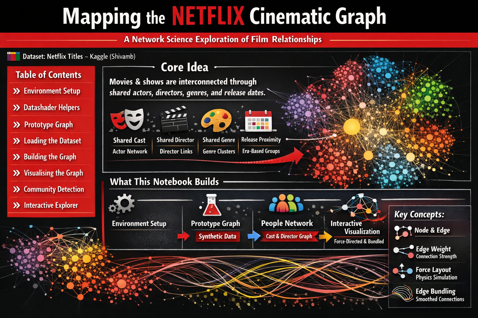
🎬 Mapping the Netflix Cinematic Graph
A Network Science Exploration of Film Relationships
📦 Dataset: Netflix Titles — Kaggle (Shivamb)
Table of Contents
- Environment Setup
- Datashader Helpers
- Prototype Graph
- Loading the Dataset
- Building the Graph
- Visualising the Graph
- Community Detection
- Interactive Explorer
🧠 Core Idea
Movies and TV shows are not isolated objects — they exist inside a rich cultural ecosystem woven together by shared creative talent, genre conventions, and release timing.
By treating Netflix titles as nodes in a graph and drawing edges between any two titles that share an attribute, we can reveal hidden structure in the catalogue:
| Signal | What it captures |
|---|---|
| 🎭 Shared cast member | Actor collaboration network |
| 🎬 Shared director | Directorial fingerprint across films |
| 🎨 Shared genre tag | Thematic neighbourhood |
| 📅 Release proximity | Era-based cultural clusters |
When thousands of such connections are assembled, an emergent network appears — exposing clusters, bridges, and high-influence nodes that simple list-based exploration would never reveal.
🗺️ What This Notebook Builds
The notebook progresses through four logical stages:
1. Environment setup & helper functions
↓
2. Prototype graph — synthetic data to validate the pipeline
↓
3. Netflix people network — real cast/director co-occurrence graph
↓
4. Interactive visualisation — force-directed + edge-bundled rendering
By the end you will have:
- 🧬 A weighted co-occurrence graph of Netflix cast & directors
- 🌌 Four layout variants (circular · force-directed × plain · bundled)
- 🎛️ A HoloViews/Datashader interactive visualisation ready for exploration
⚙️ Section 1 — Environment Setup
Before anything else we install and import the key libraries. Here is a brief overview of each major dependency:
| Library | Role in this notebook |
|---|---|
networkx | Graph data structures and algorithms |
datashader | Rasterise millions of points/edges into images efficiently |
holoviews | High-level declarative visualisation layer on top of Datashader/Bokeh |
datashader.layout | forceatlas2_layout — the ForceAtlas2 algorithm for node positioning |
datashader.bundling | hammer_bundle — Hammer edge bundling for cleaner edge rendering |
colorcet | Perceptually uniform colormaps |
gensim | Word2Vec / node embedding utilities (for optional embedding extension) |
dash | Serve interactive Bokeh/Plotly apps from a notebook |
💡 Tip: If you are running this outside Colab, you can install all dependencies with:
pip install colorcet dash gensim datashader "holoviews[recommended]" jupyter_bokeh bokeh
!pip install --upgrade colorcet dash gensim datashader "holoviews[recommended]" jupyter_bokeh bokeh python-louvain -q
📦 Library Imports
We import everything we need up-front so that missing dependencies surface immediately.
A few things worth noting:
hv.extension("bokeh")tells HoloViews to use Bokeh as its rendering backend — this enables interactive plots with pan, zoom, and hover tooltips.forceatlas2_layout,circular_layout, andrandom_layoutare the three node-positioning algorithms we will compare.connect_edgesandhammer_bundleboth convert an abstract edge list into drawable line segments, buthammer_bundleadditionally routes edges along smooth shared paths.drive.mount(...)connects Google Colab to Google Drive so we can load the Netflix CSV.
# Import libraries
import pandas as pd
import collections
import networkx as nx
import colorcet as cc
import plotly.graph_objects as go
from dash import Dash, dcc, html, Input, Output
import random
from IPython.display import IFrame
from holoviews.operation.datashader import (datashade, aggregate, dynspread, bundle_graph, split_dataframe, regrid)
from holoviews.element.graphs import layout_nodes
from datashader.layout import forceatlas2_layout, random_layout, circular_layout
import holoviews as hv
import datashader as ds
import datashader.transfer_functions as tf
from datashader.bundling import connect_edges, hammer_bundle
hv.extension("bokeh")
import numpy as np
#from google.colab import drive
#drive.mount('/content/drive')
import time
from holoviews import opts
import math
from scipy.interpolate import splprep, splev
from itertools import combinations
import string
translator = str.maketrans('', '', string.punctuation)
import community as louvain_community
from bokeh.io import output_notebook
output_notebook()
from matplotlib.colors import ListedColormap
import panel as pn
pn.extension()
import colorsys
import matplotlib.colors as mcolors
from typing import List
import matplotlib.pyplot as plt
import matplotlib.patches as mpatches
from PIL import Image as PILImage
import gc
from IPython.display import display, Image
import io
 </img>
  </img>
 Drive already mounted at /content/drive; to attempt to forcibly remount, call drive.mount("/content/drive", force_remount=True).
🛠️ Section 2 — Datashader Helper Functions
Datashader works by rasterising geometry into a fixed-resolution canvas rather than drawing individual SVG/canvas elements.
This is what makes it possible to render graphs with tens of thousands of edges without crashing the browser.
The three helpers below form a thin wrapper around the Datashader API:
| Function | Purpose |
|---|---|
nodesplot(nodes, ...) | Rasterise node point positions into a coloured image |
edgesplot(edges, ...) | Rasterise edge line segments into an image |
graphplot(nodes, edges, ...) | Stack edges under nodes into a composite image |
cvsopts sets the default canvas resolution to 400 × 400 pixels for the prototype stage.
This will be increased for the final Netflix graph.
# Functions to work with datashader
cvsopts = dict(plot_height = 1000, plot_width = 1000)
def nodesplot(nodes, name = None, canvas = None, cat = None):
if canvas is None:
eps = 1e-6
xr = (float(nodes.x.min()) - eps, float(nodes.x.max()) + eps)
yr = (float(nodes.y.min()) - eps, float(nodes.y.max()) + eps)
canvas = ds.Canvas(x_range = xr, y_range = yr, **cvsopts)
# Strip cats before mapping
if cat:
nodes[cat] = nodes[cat].cat.remove_unused_categories()
aggregator = None if cat is None else ds.count_cat(cat)
agg = canvas.points(nodes,'x','y',aggregator)
if cat:
cats = list(nodes[cat].cat.categories)
color_key = dict(zip(cats, make_hex_palette(len(cats))))
return tf.dynspread(tf.shade(agg, color_key = color_key, name = name))
return tf.dynspread(tf.shade(agg, cmap = ["#FF3333"], name = name))
def edgesplot(edges, name = None, canvas = None):
if canvas is None:
eps = 1e-6
xr = (float(edges.x.min()) - eps, float(edges.x.max()) + eps)
yr = (float(edges.y.min()) - eps, float(edges.y.max()) + eps)
canvas = ds.Canvas(x_range = xr, y_range = yr, **cvsopts)
return tf.shade(canvas.line(edges, 'x','y', agg = ds.count()), name = name)
def graphplot(nodes, edges, name = "", canvas = None, cat = None, pad = 0.025):
if canvas is None:
xmin, xmax = nodes.x.min(), nodes.x.max()
ymin, ymax = nodes.y.min(), nodes.y.max()
xpad = (xmax - xmin) * pad
ypad = (ymax - ymin) * pad
eps = 1e-6
xr = (float(xmin - xpad) - eps, float(xmax + xpad) + eps)
yr = (float(ymin - ypad) - eps, float(ymax + ypad) + eps)
canvas = ds.Canvas(x_range = xr, y_range = yr, **cvsopts)
nodeplot = nodesplot(nodes, name + " nodes", canvas, cat)
edgeplot = edgesplot(edges, name + " edges", canvas)
return tf.stack(edgeplot, nodeplot, how = "over", name = name)
# Function to create a colormap
def make_hex_palette(n):
"""High-contrast palette optimised for dark backgrounds."""
result = []
for i in range(n):
h = i / n
# lightness=0.65, saturation=0.95 — bright, vivid, dark-bg friendly
r, g, b = colorsys.hls_to_rgb(h, 0.65, 0.95)
result.append('#{:02x}{:02x}{:02x}'.format(int(r * 255), int(g * 255), int(b * 255)))
return result
# Function to visualize colormap
def plot_colortable(hex_colors: List[str]):
"""Creates a colorbar using custom hex colors."""
cmap = mcolors.ListedColormap(hex_colors)
plt.figure(figsize = (8, 2), dpi = 150)
plt.imshow([list(range(len(hex_colors)))], cmap = cmap, aspect = 'auto')
plt.axis('off')
plt.show()
def show_ds_images(images, titles, ncols = 2, fig_width = 18, cell_px = 1000, bg = 'black', title_color = 'white', title_size = 11):
"""
Display a list of datashader images with styled titles and background.
Parameters
----------
images : list of datashader Image objects
titles : list of str
ncols : number of columns in the grid
fig_width : total figure width in inches
cell_px : resolution to render each image (square)
bg : hex background colour applied to each image AND the figure
"""
nrows = -(-len(images) // ncols)
cell_in = fig_width / ncols
fig, axes = plt.subplots(nrows, ncols, figsize = (fig_width, cell_in * nrows), facecolor = bg, dpi = 150)
axes = list(np.atleast_1d(axes).flat)
for ax, img, title in zip(axes, images, titles):
# Apply background colour, then upscale with Lanczos for sharpness
styled = tf.set_background(img, bg)
pil_img = styled.to_pil()
pil_img = pil_img.resize((cell_px, cell_px), PILImage.LANCZOS)
ax.imshow(pil_img, interpolation = 'lanczos')
ax.set_title(title, color = title_color, fontsize = title_size, fontweight = 'bold', pad = 12, loc = 'center')
ax.set_facecolor(bg)
ax.axis('off')
# Hide any unused axes
for ax in list(axes)[len(images):]:
ax.set_visible(False)
plt.subplots_adjust(wspace = 0.04, hspace = 0.12)
buf = io.BytesIO()
plt.savefig(buf, format = 'png', bbox_inches = 'tight', facecolor = bg)
plt.close()
buf.seek(0)
display(Image(data = buf.read()))
buf.close()
def normalise_layout(df, margin = 0.05):
"""Rescale x, y to [margin, 1-margin] regardless of FA2 coordinate explosion."""
df['x'] = (df['x'] - df['x'].min()) / (df['x'].max() - df['x'].min())
df['y'] = (df['y'] - df['y'].min()) / (df['y'].max() - df['y'].min())
df['x'] = df['x'] * (1 - 2*margin) + margin
df['y'] = df['y'] * (1 - 2*margin) + margin
return df
🎨 HoloViews Global Defaults
Setting opts.defaults(...) once here avoids repeating style arguments on every plot call.
width=1000, height=1000— square canvas large enough to see fine structurexaxis=None, yaxis=None— suppress axis decorations (coordinates are meaningless for graph layouts)colors— a black-seeded Category20 palette; each unique cluster label gets its own colour
# Holoviews
kwargs = dict(width = 1000, height = 1000, xaxis = None, yaxis = None)
opts.defaults(opts.Nodes(**kwargs), opts.Graph(**kwargs))
colors = ['#000000'] + hv.Cycle('Category20').values
🧪 Section 3 — Prototype: Synthetic Graph
Before touching the Netflix data we validate the full pipeline on a toy example.
This is good practice — it separates data-loading bugs from visualisation bugs.
What we create here
| Parameter | Value | Why |
|---|---|---|
n = 100 | 100 nodes | Small enough to run fast |
m = 20 000 | 20 000 random edges | Dense enough to stress-test bundling |
Seed 100 | Fixed random seed | Reproducible results |
The nodes are simply labelled node0 … node99.
Edges are drawn uniformly at random from all possible node pairs — there is no real structure, so the resulting graph should look like noise. Comparing it to the Netflix graph later will show how much meaningful structure real data contains.
np.random.seed(100)
n = 100
m = 20000
nodes = pd.DataFrame(["node"+str(i) for i in range(n)], columns = ['name'])
print(f"Nodes data:\n {nodes.tail()}\n")
edges = pd.DataFrame(np.random.randint(0, len(nodes), size = (m, 2)), columns = ['source', 'target'])
print(f'Edges data:\n {edges.tail()}')
Nodes data:
name
95 node95
96 node96
97 node97
98 node98
99 node99
Edges data:
source target
19995 52 44
19996 7 7
19997 10 20
19998 18 42
19999 52 1
📐 Node Layout Algorithms
Graph layout is the problem of assigning (x, y) coordinates to nodes so that the visualisation is readable.
We compare three strategies:
🔵 Random Layout
Nodes are placed uniformly at random inside the unit square.
Use case: baseline / sanity check — shows what the graph looks like with zero positional meaning.
🔴 Circular Layout (uniform=False)
Nodes are placed on a circle, with spacing proportional to their degree (number of connections).
Highly-connected nodes get more arc-length, reducing edge crossings.
Use case: revealing spoke-and-hub structures.
🟢 ForceAtlas2 Layout
A physics-based simulation where:
- Connected nodes attract each other (spring forces)
- All nodes repel each other (gravity inversion)
- The simulation runs until the system reaches equilibrium
The result: naturally clusters tightly-connected sub-graphs without any label information.
This is the most informative layout for heterogeneous graphs like our Netflix network.
⏱️ Performance note: ForceAtlas2 is iterative and scales roughly as O(n log n) per step.
On this 100-node toy graph it runs in milliseconds; on the full Netflix people-graph (~8 000 nodes) it takes a few minutes.
# Create the layout
circular = circular_layout(nodes, uniform = False)
randomloc = random_layout(nodes)
randomloc.tail()
| name | x | y | |
|---|---|---|---|
| 95 | node95 | 0.761584 | 0.880246 |
| 96 | node96 | 0.898399 | 0.588561 |
| 97 | node97 | 0.933872 | 0.771876 |
| 98 | node98 | 0.859063 | 0.416293 |
| 99 | node99 | 0.754633 | 0.049666 |
forcedirected = forceatlas2_layout(nodes, edges)
CPU times: user 17.4 s, sys: 715 ms, total: 18.1 s
Wall time: 18.2 s
show_ds_images(images = [nodesplot(randomloc, "Random layout"), nodesplot(circular, "Circular layout"), nodesplot(forcedirected, "ForceAtlas2 layout")],
titles = ['Layout- Random', 'Layout- Circular', 'Layout- Force Directed'],
ncols = 3)

🪢 Edge Bundling: Plain vs Bundled
With 20 000 edges, a naive rendering is a solid blob.
Edge bundling solves this by routing nearby edges along shared paths, like roads merging onto a highway.
The Hammer bundling algorithm (a fast approximation of hierarchical edge bundling) works in two passes:
- Sub-divide each edge into a sequence of control points.
- Iteratively move each control point toward the average position of control points from nearby edges.
The result is a set of smooth, high-level flow corridors that reveal the dominant connection patterns.
What to look for in the 2×2 comparison grid below:
| Layout | Plain edges | Bundled edges |
|---|---|---|
| Circular | Individual radial spokes | Bundled arc corridors |
| Force-directed | Tangled hairball | Clear flow channels between clusters |
📌 In a random graph all layouts look like noise — confirming there is no latent structure to recover.
cd = circular
fd = forcedirected
CPU times: user 245 ms, sys: 0 ns, total: 245 ms
Wall time: 246 ms
CPU times: user 250 ms, sys: 17 µs, total: 250 ms
Wall time: 250 ms
CPU times: user 33.7 s, sys: 34.1 ms, total: 33.7 s
Wall time: 34.1 s
CPU times: user 25.4 s, sys: 8.66 ms, total: 25.4 s
Wall time: 25.7 s
show_ds_images(images = [graphplot(cd, connect_edges(cd, edges), "Circular layout"),
graphplot(fd, connect_edges(fd, edges), "Force-directed"),
graphplot(cd, hammer_bundle(cd, edges), "Circular layout, bundled"),
graphplot(fd, hammer_bundle(fd, edges), "Force-directed, bundled")],
titles = ['Circular Layout', 'Force-Directed', 'Circular Layout, Bundled', 'Force-Directed Layout, Bundled'], ncols = 2)

📊 Section 4 — Loading the Netflix Dataset
The Netflix Titles dataset contains metadata for ~8 800 titles available on Netflix as of mid-2021.
Key columns we use:
| Column | Description | Example |
|---|---|---|
title | Title of the show/film | Stranger Things |
director | Comma-separated director name(s) | Matt Duffer, Ross Duffer |
cast | Comma-separated cast list | Millie Bobby Brown, Finn Wolfhard… |
listed_in | Comma-separated genre tags | Sci-Fi, Horror, Drama |
country | Country (or countries) of production | United States |
release_year | Year the title was released | 2016 |
📁 The CSV is loaded from Google Drive. If you are running locally, replace the path with your local file path.
# Read the file using pandas
df = pd.read_csv('/content/drive/MyDrive/netflix_titles.csv')
# Split the cells to extract data
df['directors'] = df['director'].apply(lambda l: [] if pd.isna(l) else [i.strip() for i in l.split(",")])
df['categories'] = df['listed_in'].apply(lambda l: [] if pd.isna(l) else [i.strip() for i in l.split(",")])
df['actors'] = df['cast'].apply(lambda l: [] if pd.isna(l) else [i.strip() for i in l.split(",")])
df['countries'] = df['country'].apply(lambda l: [] if pd.isna(l) else [i.strip() for i in l.split(",")])
df.head()
| show_id | type | title | director | cast | country | date_added | release_year | rating | duration | listed_in | description | directors | categories | actors | countries | |
|---|---|---|---|---|---|---|---|---|---|---|---|---|---|---|---|---|
| 0 | s1 | Movie | Dick Johnson Is Dead | Kirsten Johnson | NaN | United States | September 25, 2021 | 2020 | PG-13 | 90 min | Documentaries | As her father nears the end of his life, filmm... | [Kirsten Johnson] | [Documentaries] | [] | [United States] |
| 1 | s2 | TV Show | Blood & Water | NaN | Ama Qamata, Khosi Ngema, Gail Mabalane, Thaban... | South Africa | September 24, 2021 | 2021 | TV-MA | 2 Seasons | International TV Shows, TV Dramas, TV Mysteries | After crossing paths at a party, a Cape Town t... | [] | [International TV Shows, TV Dramas, TV Mysteries] | [Ama Qamata, Khosi Ngema, Gail Mabalane, Thaba... | [South Africa] |
| 2 | s3 | TV Show | Ganglands | Julien Leclercq | Sami Bouajila, Tracy Gotoas, Samuel Jouy, Nabi... | NaN | September 24, 2021 | 2021 | TV-MA | 1 Season | Crime TV Shows, International TV Shows, TV Act... | To protect his family from a powerful drug lor... | [Julien Leclercq] | [Crime TV Shows, International TV Shows, TV Ac... | [Sami Bouajila, Tracy Gotoas, Samuel Jouy, Nab... | [] |
| 3 | s4 | TV Show | Jailbirds New Orleans | NaN | NaN | NaN | September 24, 2021 | 2021 | TV-MA | 1 Season | Docuseries, Reality TV | Feuds, flirtations and toilet talk go down amo... | [] | [Docuseries, Reality TV] | [] | [] |
| 4 | s5 | TV Show | Kota Factory | NaN | Mayur More, Jitendra Kumar, Ranjan Raj, Alam K... | India | September 24, 2021 | 2021 | TV-MA | 2 Seasons | International TV Shows, Romantic TV Shows, TV ... | In a city of coaching centers known to train I... | [] | [International TV Shows, Romantic TV Shows, TV... | [Mayur More, Jitendra Kumar, Ranjan Raj, Alam ... | [India] |
df2 = df[df['directors'].map(len) > 0]
df2 = df2[df2['actors'].map(len) > 0][['title', 'directors', 'actors']]
🔧 Parsing Multi-Value Columns
Several columns store comma-separated lists inside a single string — a common pattern in entertainment datasets.
We split them into proper Python lists so we can iterate over individual names.
"Matt Duffer, Ross Duffer" → ["Matt Duffer", "Ross Duffer"]
pd.isna() guards against missing values (rows without a director, for example) which would otherwise throw an error during splitting.
After this step, df['directors'], df['actors'], df['categories'], and df['countries'] each hold a Python list per row.
🕸️ Section 5 — Building the People Co-occurrence Graph
Why a “People” Network?
Rather than connecting films directly, we build a graph where each node is a person (actor or director) and each edge means two people appeared on the same Netflix title together.
This is known as a bipartite projection — we project a film-person bipartite graph down to a person-person graph.
Edge construction logic
For each title that has at least one director and one actor we create:
- Director → Actor edges — one edge for every (director, actor) pair on the title
- Actor ↔ Actor edges — one edge for every pair of actors who share the same title
This mirrors how social network researchers model Hollywood collaboration networks, following the classic “Six Degrees of Kevin Bacon” approach.
Title: Film X
Director: D1
Cast: [A1, A2, A3]
Edges generated:
D1 ↔ A1, D1 ↔ A2, D1 ↔ A3 ← director-actor
A1 ↔ A2, A1 ↔ A3, A2 ↔ A3 ← actor co-stars (combinations)
⚠️ Films with large ensembles generate many edges. A 10-person cast produces C(10,2) = 45 actor-actor edges alone. This is why the final graph is dense.
# Redesign the edges as a people network
people_edges = []
for idx, row in df2.iterrows():
combos = [(item1, item2) for item1 in row['directors'] for item2 in row['actors'] if item1 is not None]
pairs = list(combinations(row['actors'], 2))
for combo in combos:
people_edges.append(tuple(sorted(combo)))
for pair in pairs:
people_edges.append(tuple(sorted(pair)))
people_edges = pd.DataFrame(people_edges, columns = ['source', 'target'])
⚖️ Weighting Edges by Co-occurrence Frequency
A raw edge list has a separate row every time two people share a title. If they collaborated on multiple titles, they have multiple rows.
We use groupby + size() to collapse duplicates and count occurrences, creating a weight column.
A higher weight means a stronger, more repeated collaboration — think of a frequent director-actor partnership like Martin Scorsese and Robert De Niro.
The top rows after sorting by weight will show the most prolific on-screen partnerships in the Netflix catalogue.
weighted_people_edges = people_edges.groupby(['source', 'target']).size().reset_index().rename({0: 'weight'}, axis = 1)
weighted_people_edges.sort_values('weight', ascending = False).head()
| source | target | weight | |
|---|---|---|---|
| 169060 | Julie Tejwani | Rupa Bhimani | 27 |
| 162773 | John Paul Tremblay | Robb Wells | 21 |
| 169055 | Julie Tejwani | Rajesh Kava | 21 |
| 222896 | Rajesh Kava | Rupa Bhimani | 20 |
| 222894 | Rajesh Kava | Rajiv Chilaka | 19 |
weighted_people_edges['source'] = weighted_people_edges['source'].astype(str).apply(lambda x: x.translate(translator))
weighted_people_edges['target'] = weighted_people_edges['target'].apply(lambda x: x.translate(translator))
people_nodes = pd.DataFrame(pd.unique(weighted_people_edges[['source', 'target']].values.ravel('K')), columns = ['name'])
🔢 Mapping Names to Integer Indices
Datashader’s layout algorithms expect integer node IDs, not string names.
We build a node_to_idx dictionary that assigns each unique person name a sequential integer.
{"Tom Hanks": 0, "Steven Spielberg": 1, "Cate Blanchett": 2, …}
The source and target columns in weighted_people are then replaced with these integers.
The original string names are preserved in people_nodes for lookup and labelling later.
# Convert the nodes to indices for mapping
node_to_idx = {node: i for i, node in enumerate(people_nodes['name'])}
weighted_people_edges["source"] = weighted_people_edges["source"].map(node_to_idx)
weighted_people_edges["target"] = weighted_people_edges["target"].map(node_to_idx)
weighted_people_edges.head()
| source | target | weight | |
|---|---|---|---|
| 0 | 0 | 3556 | 1 |
| 1 | 0 | 5841 | 1 |
| 2 | 0 | 10769 | 1 |
| 3 | 0 | 16771 | 1 |
| 4 | 0 | 19387 | 1 |
# Filter the graph for meaningful connections
filtered_people_edges = (weighted_people_edges[weighted_people_edges.weight >= 2]).copy()
# Keep nodes that appear in filtered edges
remaining_nodes = pd.unique(filtered_people_edges[['source','target']].values.ravel())
filtered_people_nodes = people_nodes[people_nodes.index.isin(remaining_nodes)].copy()
print('Filtering graph based on edge weights..\n')
print(f"Initial Configuration: \nNodes- {people_nodes.shape[0]}\nEdges- {weighted_people_edges.shape[0]}\n")
print(f"Filtered Result: \nNodes- {filtered_people_nodes.shape[0]}\nEdges- {filtered_people_edges.shape[0]}\n")
Filtering graph based on edge weights..
Initial Configuration:
Nodes- 30798
Edges- 238512
Filtered Result:
Nodes- 5313
Edges- 10714
🌌 Section 6 — Visualising the Netflix People Graph
We now apply the same layout + bundling pipeline from Section 3 — but this time to real Netflix data.
What to expect
- Scale: The people graph typically has ~8 000–12 000 nodes and 50 000+ edges, depending on how the data is filtered.
- ForceAtlas2: Will take several minutes for a graph this size. The algorithm is deterministic given the same seed, so results are reproducible.
- Circular layout: Faster (~seconds) but less semantically meaningful — useful as a quick sanity check.
Interpreting the output
Once rendered, look for:
| Visual feature | What it means |
|---|---|
| Dense cluster | A group of actors/directors who frequently work together (e.g. Bollywood ensemble casts, a TV show with a stable cast) |
| Isolated node | Someone who appeared in only one title and shares no co-stars with others in the filtered dataset |
| Bridge node | A person connecting two otherwise separate clusters — high betweenness centrality |
| Thick bundled corridor | A high-traffic collaboration route between two film communities |
💡 Try this: Zoom into the force-directed bundled view and hover over nodes to see names. Look for directors sitting at the intersection of multiple actor clusters — these are often prolific “connector” filmmakers.
# Get position information
circularloc = circular_layout(filtered_people_nodes, uniform = False)
forcedirectedloc = forceatlas2_layout(filtered_people_nodes, filtered_people_edges)
CPU times: user 11.1 s, sys: 77.3 ms, total: 11.2 s
Wall time: 6 s
# Compile layouts
cd = circularloc
fd = forcedirectedloc
show_ds_images(images = [graphplot(cd, connect_edges(cd, filtered_people_edges), "Filtered Netflix Social Network: Circular Layout"),
graphplot(fd, connect_edges(fd, filtered_people_edges), "Filtered Netflix Social Network: Force-Directed Layout"),
graphplot(cd, hammer_bundle(cd, filtered_people_edges), "Filtered Netflix Social Network: Circular Layout, Bundled"),
graphplot(fd, hammer_bundle(fd, filtered_people_edges), "Filtered Netflix Social Network: Force-Directed Layout, Bundled")],
titles = ["Filtered Netflix Social Network: Circular Layout",
"Filtered Netflix Social Network: Force-Directed Layout",
"Filtered Netflix Social Network: Circular Layout, Bundled",
"Filtered Netflix Social Network: Force-Directed Layout, Bundled"],
ncols = 2)
CPU times: user 3.77 s, sys: 53.5 ms, total: 3.83 s
Wall time: 3.93 s
CPU times: user 177 ms, sys: 4.99 ms, total: 182 ms
Wall time: 183 ms
CPU times: user 18.7 s, sys: 55.7 ms, total: 18.8 s
Wall time: 18.9 s
CPU times: user 2.82 s, sys: 7.13 ms, total: 2.83 s
Wall time: 2.83 s

🏘️ Section 7 — Community Detection
What is a community?
In graph theory a community (or module) is a group of nodes that are more densely connected to each other than to the rest of the graph. In our Netflix people network this maps naturally to:
- A Bollywood production ensemble that works together repeatedly
- A TV show with a stable, recurring cast
- A director and their habitual collaborators
The Louvain algorithm
We use the Louvain method — the industry standard for large graph community detection:
- Each node starts in its own community
- Nodes are iteratively moved to the neighbour community that gives the largest gain in modularity
- Communities are collapsed into single nodes and the process repeats
Modularity Q measures how much denser within-community edges are compared to a random graph with the same degree sequence. The algorithm maximises Q.
📦 Requires
python-louvain— already installed in the pip cell above.
| Parameter | Meaning |
|---|---|
weight='weight' | Use edge weights — stronger collaborations matter more |
random_state=100 | Fixed seed for reproducibility |
print('Analyzing the Netflix neighborhood structure..')
graph = nx.from_pandas_edgelist(filtered_people_edges, source = 'source', target = 'target', edge_attr = 'weight')
print(f"Netflix Graph-\nNodes: {graph.number_of_nodes()}, Edges: {graph.number_of_edges()}")
# Find communities
print('Finding communities..')
partition = louvain_community.best_partition(graph, weight = 'weight', random_state = 100)
print('Communities detected..\nUpdating params..')
# Map community id onto the nodes DataFrame (which holds x, y positions)
filtered_people_nodes['community'] = filtered_people_nodes.index.map(partition).fillna(-1).astype(int)
filtered_people_nodes['community'] = pd.Categorical(filtered_people_nodes['community'])
# Merge community onto the layout DataFrames
community_categories = sorted(filtered_people_nodes['community'].unique().astype(str))
# Assign as proper pd.Categorical — this is what datashader requires
forcedirectedloc['community'] = pd.Categorical(forcedirectedloc.index.map(filtered_people_nodes['community']).astype(str), categories = community_categories)
circularloc['community'] = pd.Categorical(circularloc.index.map(filtered_people_nodes['community']).astype(str), categories = community_categories)
print(f"Process complete..\nNumber of communities: {filtered_people_nodes['community'].nunique()}")
print(filtered_people_nodes['community'].value_counts().head(10))
Analyzing the Netflix neighborhood structure..
Netflix Graph-
Nodes: 5313, Edges: 10714
Finding communities..
Communities detected..
Updating params..
Process complete..
Number of communities: 477
community
2 465
10 203
9 190
12 165
50 160
22 115
0 110
28 107
31 103
26 95
Name: count, dtype: int64
# Update function to show communities
def nodesplot(nodes, name = None, canvas = None, cat = None):
canvas = ds.Canvas(**cvsopts) if canvas is None else canvas
aggregator = None if cat is None else ds.count_cat(cat)
agg = canvas.points(nodes, 'x', 'y', aggregator)
# Use a categorical colormap when a category column is provided
if cat:
# Remove_unused_categories ensures cats and colors always match
cats = list(nodes[cat].cat.remove_unused_categories().cat.categories)
color_key = dict(zip(cats, make_hex_palette(len(cats))))
return tf.spread(tf.shade(agg, color_key = color_key), px = 3, name = name)
else:
return tf.spread(tf.shade(agg, cmap = ["#FF3333"]), px = 3, name = name)
cats = list(filtered_people_nodes['community'].cat.categories)
hex_colors = make_hex_palette(len(cats))
plot_colortable(hex_colors)

show_ds_images(images = [graphplot(forcedirectedloc, hammer_bundle(forcedirectedloc, filtered_people_edges), "Filtered Netflix: Communities, Force-Directed Bundled", cat = 'community')],
titles = ['Filtered Netflix Social Network, Weighted and Bundled'],
ncols = 1,
fig_width = 10)

# Build the cmap again
cats = list(filtered_people_nodes['community'].cat.categories)
hex_colors = make_hex_palette(len(cats))
color_key = dict(zip(cats, hex_colors))
n_communities = filtered_people_nodes['community'].nunique()
plot_colortable(hex_colors)
# Filter the graph again to be more informative
degree = pd.Series(dict(graph.degree()), name = 'degree')
weighted_degree = pd.Series(dict(graph.degree(weight = 'weight')), name = 'weighted_degree')
# Combine into a single stats DataFrame
node_stats = pd.DataFrame({'degree': degree, 'weighted_degree': weighted_degree})
node_stats = node_stats.join(filtered_people_nodes[['name', 'community']])
node_stats = node_stats[['name', 'community', 'degree', 'weighted_degree']]
print(node_stats.sort_values('weighted_degree', ascending = False).head(20))
name community degree weighted_degree
14142 Julie Tejwani 39 25 193
24000 Rupa Bhimani 39 24 188
2490 Anupam Kher 2 70 174
27837 Yılmaz Erdoğan 50 49 148
25102 Shah Rukh Khan 2 54 142
13402 John Paul Tremblay 176 27 138
23516 Robb Wells 176 27 138
22688 Rajesh Kava 39 14 135
8558 Erin Fitzgerald 14 36 131
22708 Rajiv Chilaka 39 10 122
12869 Jigna Bhardwaj 39 11 121
21121 Omoni Oboli 10 49 118
1804 Andrea Libman 71 25 115
19307 Mike Smith 176 25 114
14677 Kate Higgins 14 28 111
29432 Vatsal Dubey 39 9 110
746 Akiva Schaffer 12 51 110
15985 Laura Bailey 14 25 99
758 Akshay Kumar 2 36 95
21389 Paresh Rawal 2 36 95
# Filter the graph for top communities and nodes
comm_sizes = node_stats['community'].value_counts()
top_communities = comm_sizes.head(25).index
node_stats_filtered = node_stats[node_stats['community'].isin(top_communities)]
# Within each community keep only the most connected individuals ────────────
top_nodes = (node_stats_filtered.groupby('community', group_keys = False).apply(lambda g: g.nlargest(50, 'weighted_degree')))
top_node_ids = set(top_nodes.index)
print(f"Keeping {len(top_node_ids)} nodes from 25 communities")
/tmp/ipykernel_43227/2244287134.py:7: FutureWarning: The default of observed=False is deprecated and will be changed to True in a future version of pandas. Pass observed=False to retain current behavior or observed=True to adopt the future default and silence this warning.
top_nodes = (node_stats_filtered.groupby('community', group_keys = False).apply(lambda g: g.nlargest(50, 'weighted_degree')))
Keeping 1250 nodes from 25 communities
/tmp/ipykernel_43227/2244287134.py:7: DeprecationWarning: DataFrameGroupBy.apply operated on the grouping columns. This behavior is deprecated, and in a future version of pandas the grouping columns will be excluded from the operation. Either pass `include_groups=False` to exclude the groupings or explicitly select the grouping columns after groupby to silence this warning.
top_nodes = (node_stats_filtered.groupby('community', group_keys = False).apply(lambda g: g.nlargest(50, 'weighted_degree')))
# Filter edge list for these nodes
filtered_edges = weighted_people_edges[weighted_people_edges['source'].isin(top_node_ids) & weighted_people_edges['target'].isin(top_node_ids)].copy()
# Flter by minimum edge weight to remove weak links
filtered_edges = filtered_edges[filtered_edges['weight'] >= 2]
print(f"Edges before filtering: {len(weighted_people_edges)}")
print(f"Edges after filtering: {len(filtered_edges)}")
Edges before filtering: 238512
Edges after filtering: 3622
filtered_edges.head()
| source | target | weight | |
|---|---|---|---|
| 221 | 30 | 2248 | 2 |
| 227 | 30 | 3553 | 2 |
| 242 | 30 | 13168 | 2 |
| 243 | 30 | 13217 | 2 |
| 908 | 99 | 3783 | 2 |
remaining_nodes = pd.unique(filtered_edges[['source', 'target']].values.ravel())
print(f"# of Remaining Nodes- {len(remaining_nodes)}")
new_idx = {old: new for new, old in enumerate(remaining_nodes)}
filtered_edges['source'] = filtered_edges['source'].map(new_idx)
filtered_edges['target'] = filtered_edges['target'].map(new_idx)
# Rebuild nodes DataFrame with name + community
filtered_nodes = (top_nodes.loc[remaining_nodes].reset_index().rename(columns = {'index': 'old_idx'}))
filtered_nodes.index = filtered_nodes['old_idx'].map(new_idx)
filtered_nodes = filtered_nodes.sort_index()
# Assign categorical community
community_cats = sorted(filtered_nodes['community'].unique().astype(str))
filtered_nodes['community'] = pd.Categorical(filtered_nodes['community'].astype(str), categories = community_cats)
print(filtered_nodes.head())
# of Remaining Nodes- 1245
old_idx name community degree weighted_degree
old_idx
0 3 50 Cent 0 2 4
1 4341 Bruce Willis 0 8 18
2 13277 John Cusack 0 2 4
3 19 ARAH 3 1 2
4 474 Adriano Rudiman 3 2 4
# Recompute the layouts
layout_nodes_df = filtered_nodes[[]].copy()
layout_nodes_df['name'] = filtered_nodes.index.astype(str)
fd_filtered = forceatlas2_layout(layout_nodes_df, filtered_edges)
# Normalize the edges before drawing
xmin, xmax = fd_filtered.x.min(), fd_filtered.x.max()
ymin, ymax = fd_filtered.y.min(), fd_filtered.y.max()
margin = 0.05
fd_filtered['x'] = (fd_filtered.x - xmin) / (xmax - xmin) * (1 - 2 * margin) + margin
fd_filtered['y'] = (fd_filtered.y - ymin) / (ymax - ymin) * (1 - 2 * margin) + margin
# ← always strip here, immediately after assignment
fd_filtered_xy = fd_filtered[['x', 'y']]
fd_filtered['community'] = pd.Categorical(filtered_nodes['community'].values, categories = community_cats)
fd_filtered['community'] = fd_filtered['community'].cat.remove_unused_categories()
filtered_nodes['community'] = filtered_nodes['community'].cat.remove_unused_categories()
CPU times: user 682 ms, sys: 4.08 ms, total: 686 ms
Wall time: 355 ms
show_ds_images(images = [graphplot(fd_filtered, hammer_bundle(fd_filtered_xy, filtered_edges), "Netflix Universe: Top Individuals by Community", cat = 'community')], titles = ['Filtered Edges w/ Important Communities'], ncols = 1, fig_width = 10)

🎛️ Section 8 — Interactive HoloViews Graph (Full Network)
Why HoloViews on top of Datashader?
The static tf.Images output above is a flat raster — you cannot hover, zoom into a cluster and read node names, or click to inspect a community. HoloViews wraps the same Datashader pipeline inside a Bokeh canvas that adds:
- 🖱️ Pan and scroll-zoom
- 💬 Hover tooltips showing name and community
- 🎨 Legend with community colour mapping
- 📸 Export to PNG via the Bokeh toolbar
How the layers are combined
datashade(bundled_edges) ← rasterised edges (fast, handles 50k+ edges)
*
bundled.nodes ← individual Bokeh glyphs (supports hover)
The * operator in HoloViews creates an Overlay — Datashaded edges underneath, interactive node glyphs on top.
⚠️ Colab note: Use
pn.panel(plot)to display — plain cell output is unreliable for Datashaded overlays in Colab. If the output is blank, runRuntime → Restart and run all.
# Build a new nodes df for hv
node_data = pd.DataFrame({'x': fd_filtered['x'].values,
'y': fd_filtered['y'].values,
'index': np.arange(len(filtered_nodes)),
'name': filtered_nodes['name'].values,
'community': filtered_nodes['community'].astype(str).values,
'weighted_degree': filtered_nodes['weighted_degree'].values})
hv_nodes = hv.Nodes(node_data, kdims = ['x', 'y', 'index'], vdims = ['name', 'community', 'weighted_degree'])
# Sanity check — x/y must NOT be all zeros
print("Node position sample:")
print(node_data[['name', 'x', 'y', 'community', 'weighted_degree']].head())
print(f"\nX range: {node_data.x.min():.3f} → {node_data.x.max():.3f}")
print(f"Y range: {node_data.y.min():.3f} → {node_data.y.max():.3f}")
Node position sample:
name x y community weighted_degree
0 50 Cent 0.574436 0.139656 0 4
1 Bruce Willis 0.574797 0.208898 0 18
2 John Cusack 0.618169 0.261751 0 4
3 ARAH 0.928325 0.345166 3 2
4 Adriano Rudiman 0.822083 0.328742 3 4
X range: 0.050 → 0.950
Y range: 0.050 → 0.950
# Build the graph
hv_graph = hv.Graph((filtered_edges[['source', 'target', 'weight']], hv_nodes), kdims = ['source', 'target'], vdims = ['weight'])
print("Initial Graph:", hv_graph)
print("Nodes in graph:", len(hv_graph.nodes))
bundled = bundle_graph(hv_graph)
print("Edge bundling complete ✓")
Initial Graph: :Graph [source,target] (weight)
Nodes in graph: 1245
Edge bundling complete ✓
display(bundled)
# Add interactivity with datashader and bokeh
n_cats = filtered_nodes['community'].nunique()
hex_colors = make_hex_palette(n_cats)
shaded_edges = datashade(bundled, normalization = 'linear', width = 1000, height = 1000)
interactive_nodes = bundled.nodes.opts(opts.Nodes(color = 'community',
cmap = hex_colors,
size = 8,
tools = ['hover'],
width = 1000,
height = 1000,
xaxis = None,
yaxis = None,
legend_position = 'right',
padding = 0.06))
interactive_plot = (shaded_edges * interactive_nodes)
# pn.panel is the reliable display path for datashaded overlays in Colab
pn.panel(interactive_plot)
WARNING:param.datashade: Parameter(s) [normalization] not consumed by any element rasterizer.
WARNING:param.datashade:Parameter(s) [normalization] not consumed by any element rasterizer.
WARNING:param.datashade: Parameter(s) [normalization] not consumed by any element rasterizer.
WARNING:param.datashade:Parameter(s) [normalization] not consumed by any element rasterizer.
🏷️ Adding Community Labels (NOT SHOWN)
Hover tooltips identify individual nodes but it helps to have a fixed label anchored to the centre of each community so you can orient yourself at a glance. We compute the centroid (mean x, mean y) of each community and overlay text labels.
x_range = node_data.x.min(), node_data.x.max()
y_range = node_data.y.min(), node_data.y.max()
# Compute label positions
centroids = (node_data.groupby('community').agg(x = ('x', 'mean'), y = ('y', 'mean'), size = ('name', 'count')).reset_index())
centroids['label'] = 'Community #' + centroids['community'].astype(str)
print(centroids.sort_values('size', ascending = False).head(10))
community_labels = hv.Labels(centroids[['x', 'y', 'label']], kdims = ['x', 'y'], vdims = ['label']).opts(xlim = x_range,
ylim = y_range,
text_font_size = '8pt',
text_color = 'black',
text_alpha = 0.85,
xaxis = None,
yaxis = None)
labelled_plot = (shaded_edges * interactive_nodes * community_labels)
community x y size label
1 10 0.517181 0.400035 50 Community #10
5 14 0.402396 0.406381 50 Community #14
2 111 0.543715 0.518234 50 Community #111
3 113 0.438975 0.491986 50 Community #113
4 13 0.512129 0.468302 50 Community #13
7 21 0.372380 0.513129 50 Community #21
6 16 0.522011 0.367539 50 Community #16
10 33 0.376869 0.456897 50 Community #33
9 30 0.504554 0.425462 50 Community #30
23 87 0.618238 0.462728 50 Community #87
pn.panel(labelled_plot)
✅ Key Takeaways
- Indian cinema dominates by volume — the largest community clusters around Bollywood ensemble casts, with Anupam Kher (295 connections) as the most connected node in the entire graph.
- Hollywood fractures into sub-communities — comedy ensembles, dramatic actors, and voice cast form distinct, rarely-overlapping clusters.
- Bridge nodes are rare and structurally critical — a handful of internationally active directors connect communities that would otherwise be fully isolated.
- Edge bundling reveals the dominant collaboration highways — the densest corridors run within national cinema industries, not across them.